
Dish N Dine is a recipe app with key features like hands-free voice-guided recipes, rating, saving, sharing, and posting. Dish N Dine is a one-stop-shop app for all your recipe needs.

About Dish N Dine
Inspired by a trip home cooking for the holidays, what was once a fun and happy way to bond and catch up, quickly became soured by the growing frustrations my mom had following along to a recipe with her iPad. Which in turn, changed my job from honorary Sous Chef to iPad holder and recipe reader. And just like that, the moment was ruined. I was going through reading the steps from her internet-found recipe while her hands were messy and she was growing agitated. I empathized with this struggle, so I decided to make it my capstone project. First things first, it was time to see if this problem existed for others as well.
Tools Used
-
Adobe XD
-
MIRO
-
InVision
-
Photoshop
-
Illustrator
-
Sketch
My Role
-
Visual Design
-
Prototyping
-
User Testing
-
User Research
-
Interaction Design
-
UI/UX Design
How can you follow along to recipes easier on a device?
When people search for new recipes in today’s age they are no longer pulling them from a cookbook, but rather online. Even more specifically, online from their phone or tablet at any given time of the day. Then once a great recipe is chosen- they save it for later or immediately begin to cook, go back to locked screens with messy hands, not knowing the next step, having to scroll all the way through again, etc- mistakes begin and frustration continues to grow.

How might we simplify and amplify the user’s overall experience while following along to a recipe while cooking?
PROBLEM STATEMENT
I want to make it easier for the user’s to follow along with recipes while using their devices. As of January 2020, Voicebot found that 34.4 % of all US adults (almost 90 million people) have adopted the use of smart home speakers/devices to help dictate for them and their needs. Intelligence such as navigation apps is a tool used daily by millions and millions of people, why not apply that same technology to daily tasks such as cooking. Currently, there are plenty of resources and apps to help users find the perfect recipes, but what is missing is what comes next - guiding them through their recipes. Dish N Dine is ready, willing, and able to do just exactly that. Let’s see how I made it happen.
Designing a Mobile App
Interviews gave a clear insight into what the user liked and what they were wishing existed when carrying through these tasks. Key insights into their lives and personalities really started to build a strong foundation for additional research, and mapping out additional ideations and defining Dish N Dine's personas and MVP's.
Planning the Research and Design


Research
Synthesis
Ideation
Implementation
-
Secondary Research
-
Online Surveys
-
Interviews
-
HMW's
-
Insights and Opportunities
- Affinity/Empathy Mapping
-
MVP's
-
Sketching
-
Storyboards/Comic Strips
-
User Flows
-
Wireframes
-
Prototypes
-
User-based testing
-
User feedback
Research
Gartner (research firm) predicted in 2015; that by 2018 30% of interactions with technology will be through ‘conversations’ with smart machines”. Today, in 2020 a consumer survey by Voicebot found that 87.7 m U.S. adults were using smart speakers as of January 2020.” Meaning, U.S. smart speaker users 32% over January 2019 and 85% over January 2018. Exceeding Gartner’s original prediction. Talking to devices has become second nature, why not marry together with people’s love and need to cook and convenience to cook with their phones!
User Research
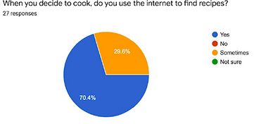
27 people responded to a screener survey I posted on Instagram. I was looking for users with knowledge of social media, as well as users that use their smart devices every day to solve their immediate needs. Some key findings were:
-
70.4% used the internet from their phones to find recipes
-
85% were between the age of 26-35 identifying as females
-
On average users searched for recipes 2-3 times a week
-
44% of participants claimed they were frustrated while following along with a smartphone but continued anyway out of necessity
The surveys helped me find the right users to interview, ask more about their needs and comforts while cooking, their recipe finding habits, and their likes and dislikes when following along to a recipe with a device.


“I love Pinterest, getting inspired and pinning
recipes for later with videos and great pics”
“ I go to sites I know and trust to see if they
have what I’m looking for before I search
elsewhere”
“We have a family chat on Groupme where my mom
shares our family recipes, but I always lose them”
“I call my mom or like the videos on IG that tell me
what to do, the guidance is really helpful”
“I save recipes on Pinterest, IG, bookmarks…and then I forget! I want on a Sunday after grocery shopping something be like BAM cook this with all the current free time you have”

Interviews gave a clear insight into what the user liked and how they found recipes. As well as adding additional ideas to Dish N Dine, simplifying and perfecting the voice-guided feature, and adding key elements inspired by existing apps users found comfort in using confidently. It was insightful to ask perceived users questions about their cooking habits. Although the responses were overall diverse, many key points began to create a clear pattern in the wants and needs of users. Which in turn made it easy to categorize these notes into specific values these users had, and ultimately helping with empathy mapping and defining personas.
Mapping & Personas


There were 9 categories I sorted my notes and quotes from my interviews into while affinity mapping. And from there, I was starting to see three very clear different personas that all needed different functions within Dish N Dine, while all ultimately having the same #1 MVP- to find and cook a recipe with a smart device. The bold persona “the Head Chef” knew what she wanted, she cooked often from memory but wanted a source of inspiration, scanning recipes for the key points than making up the rest as she went. With a strong sense of self, Antonia meaning bold, and fearless leader became the name for “the Head Chef” Persona. Jade, meaning cool, justice, and clarity became the name for the younger persona, “the Browser” who valued everything based on social media, and constantly scoured her apps for videos/photos she’d like and save to try another time. “The Old Soul” persona, took on a different style of cooking altogether. Otis, meaning wealth and fortune in knowledge was our male persona who was truly obsessed with cooking, owning all the devices needed to make the perfect meals, and using his cooking skills to show his love for others. He has tried and true sites and blogs he follows and needs easy recipe guidance specifically when cooking by the grill, yet he would like better options for saving, sharing, and easy access later on for his recipes.
Brainstorming


Before diving into wireframing from the data I have gathered so far, I believed it was necessary to take a step back and do some brainstorming activities before continuing with site mapping and user flows. The expansion of the personas proved that there were needs these users had that needed to be added into my original perception of the Dish N Dine app. I decided to brainstorm in a few different types of ways. Such as opening up inspiration from other industries, asking different priority levels of HMW's and resolve them through quick sketching, Crazy 8's, and word association, in hopes that these would all help inspire possible solutions for the personas established pain points. This ideation process helped expand solutions to resolve user's pains and define my user's stories. Which next helped with site mapping and user flows.
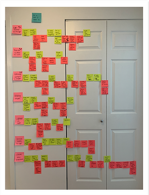
Site Mapping & User Flows
After making a sticky note layout of the process, mapping out the site map for Dish N Dine, writing down an MVP list of features needed, distilling group names, and sorting the data through a standardization grid, I began sketching out a sitemap. This was a really exciting process as I began to see the app take shape in a completely new, more fully-formed way. Spending this crucial time in details and data reduced the fuzziness around the overall vision and brought forth a more concrete and complete plan - something all stakeholders could already appreciate.


Sketching
With a solid foundation of vision, analysis, strategy, & validated research in place, I arrived at probably the most exciting and gratifying stage: sketching and beginning wire flows and wireframing. Trying a myriad of layouts and getting quick feedback along the way, I learned the importance of staying flexible and keeping fidelity low at the beginning.

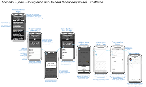
Low-Fid.Wireframing & Wireflows
With rough sketches in hand, it was time to create the initial low-fidelity wireframes being built out by following my research, MVP's site mapping and user flows. Then it was from here that I expanding on these scenarios through analyzing how everything works into my wireflows. From these low fidelity wireframes it was time to set up wireflows to ensure every page had a meaning while continuing to design the remaining elements of wireframes and prototypes.


Moodboard & Style Guide
Once all scenarios and pages were built out as low fidelity mockups, it was time to shift gears before getting into high fidelity wireframing. Having the foundation and structure of pages for the app down, I then created a mood board then a style guide. To streamline colors, establish consistent design features, and an overall cohesive visual design and UI for the app.


High Fidelity Wireframes
Once solidifying a visual direction and creating cohesive elements based on the style guide, it was time to create high fidelity wireframes that would be used for my prototype. There were a couple of sets of edits through presenting and working with my mentor, which stakeholders can appreciate the attention to detail and willingness to iterate the UI. It was then that Dish N Dine started to visually represent fully all the research, mapping, sketching, and flows that went into creating it. With the high fidelity wireframes fully built out, it was time to finally piece all this information into a functioning prototype to begin testing with.


Prototype
Having a design career background for the past 6 years in the fashion industry, creating the visual elements of Dish N Dine came quite easily. But the most gratifying part of it all was being able to see the process of building this app and the weeks of research, ideations, wireframing, and iterations finally come to life. From these wireframes, I had successfully executed building my prototype and was ready to move onto the next stop of the process - Testing. Testing would provide feedback to see whether I had taken all user's needs into consideration as well as be able to iterate any necessary features, elements and critiques given by users during this time.
The video shown above shows the Dish N Dine working prototype after a round of iterations based on user testing feedback.
User Testing
Eager to get valuable feedback, as I waited to finalize scheduling for testing I wrote out a moderated usability test plan, a testing script, tasks for the users to perform, and an after-testing SUS survey for users to give their feedback. I had 5 participants in each round. After about the 3rd test of the first round, it was clear that there began to form a consistent pattern of some key elements users asked for clarification and needed, ontop of other fascinating and insightful information. As I went through each test recording and notes I decided to create a grid with the most valuable user feedback I received, and checked off what user's said and how many times it came up. There were 3 KEY findings that came up by 3 or more out of the users I chose to focus on when it came time for iternations. 1. During setting up their preferences in the onboarding process the Budget section was hard for many users. What it meant and the definition of the timeframe it encompassed was confusing to them and therefore a part I thought was valuable to have in the app became overlooked as a helpful feature. 2. Labeling images, in the recipes discovery page images weren't originally labeled which made it hard for users to find recipes they were being asked to find, as well as a great point that if you are just browsing it's nice to look at, but if you have an exact recipe you are trying to find, it could become frustrating and 3. Adding photos of user's recipes. When asked to carry out this task users were pressing the plus button at the center of the screen because it was similar feature to the ever-popular instragram, but users became thrown off when it was meant to add a a new recipe and not a photo. It was clear these features were in dire need of iterations in order to benefit the user experience. Overall however, despite such key elements needing corrections the overall SUS was quite high.


With all this amazing user feedback it was time to iterate and do a second round of testing. My intention after my 2nd round of testing was to begin finalizing corrections, but when I received the second round of user's SUS scores, I realized they were much lower than the first round's - even with some major iterations from testing feedback put in place. After analyzing the data and getting feedback from my mentor, it was then that we realized our demographics were incorrect and therefore skewing the data. My initial research and feedback from screeners at the beginning of this process had proved that 85% of users were likely to be between the age of 26-35 identifying as females. During my first round of user testing my ratio was 4 female to 1 male, yet my second round of testing was 3 female to 2 male. While any gender identification is welcome to use the app, this ratio had to hold true during all of the rounds of user testing in order to receive the proper data, and therefore a third and final round of testing was needed.


Overall Dish N Dine was well received, which is great news as a UX Designer as well as a stakeholder or investor on this project. However, the design process never stops and continuous iterations, new developments, and app updates would all benefit the continuous success and growth of Dish N Dine if it were a real functioning app. As my capstone project Dish N Dine was my largest project undertaking while transitioning my career into a UX Designer, and I can happily summarized that I grew as a designer and learned every element of what goes into UI/UX. While I am a seasoned designer, what I have valued most from this process was the data and the user feedback. An idea can be great, but if it's not what users want and need- its only just an idea. It takes research, talking to users during interviews, gathering data, creating with users in mind and testing to make an idea into something more. Taking constructive user feedback in every step of the process only helped validate and solidify every design decision I took while creating Dish N Dine.
Another key takeaway I learned was at the end how important consistency plays a role in gathering data. All rounds of moderated user testing had to be under the same conditions and consistent grounds in order to correctly gather data. Validating design decisions are key and at the end the user's feedback is the most important thing when designing.
Feel free to check out Dish N Dine's prototype for yourself and please don't hesitate to send some feedback, as a design community I know we all know how important that is!
Interact with Dish N Dine
Check out Dish N Dine's Prototype:

Feel free to see some further images of the process of creating Dish N Dine below:


Let's work together on your next project!
Send me an email